


reach out to me here
tell your story here
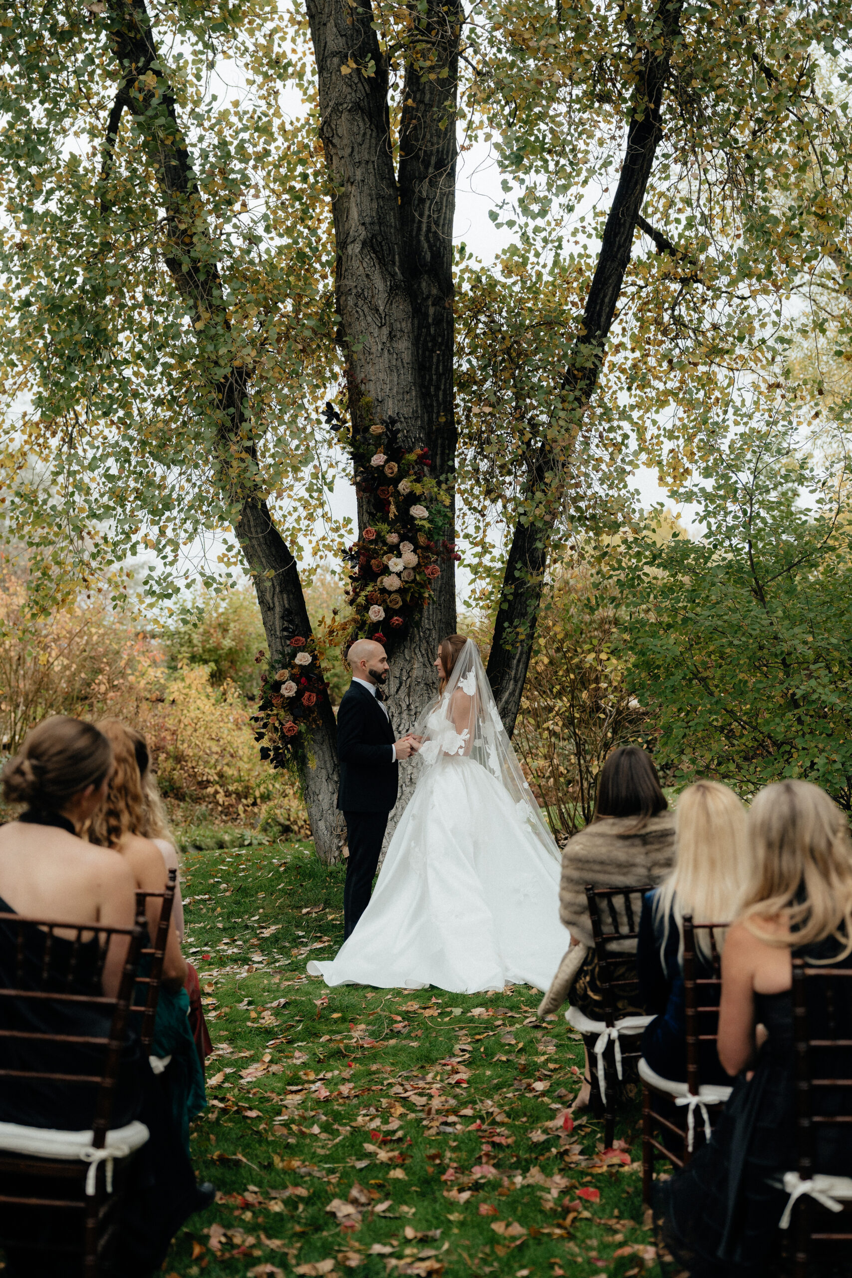
Spring weddings have such a special feel to them. The light is softer, everything is starting to bloom, and the day just feels fresh and romantic. One thing couples do not always realize is how much their color palette affects how their photos turn out.
Some colors naturally photograph better than others. They complement skin tones, work with natural light, and blend beautifully with outdoor spring settings. If you are planning a spring wedding and feeling stuck on colors, here are a few palettes I love and see photograph beautifully again and again!
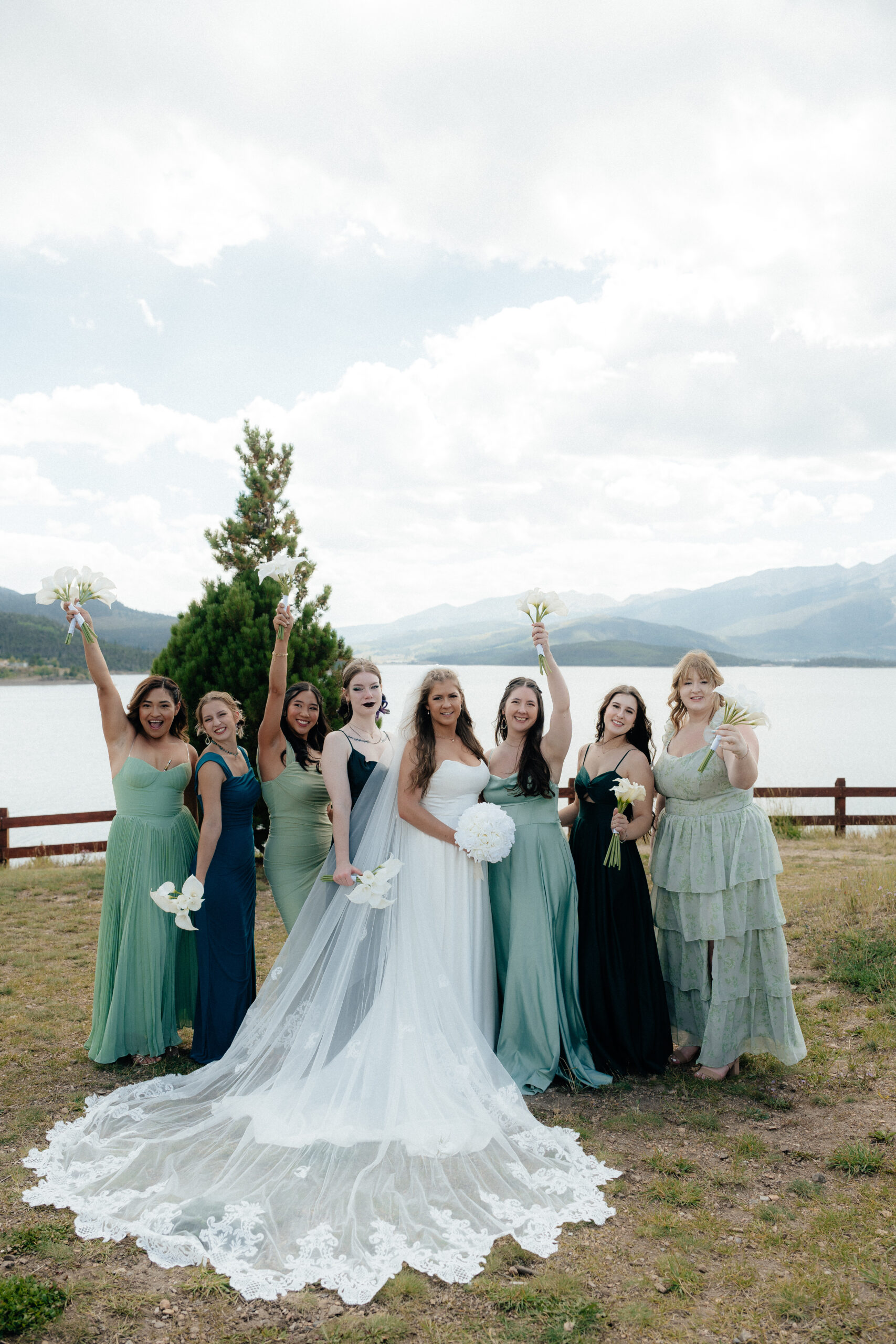
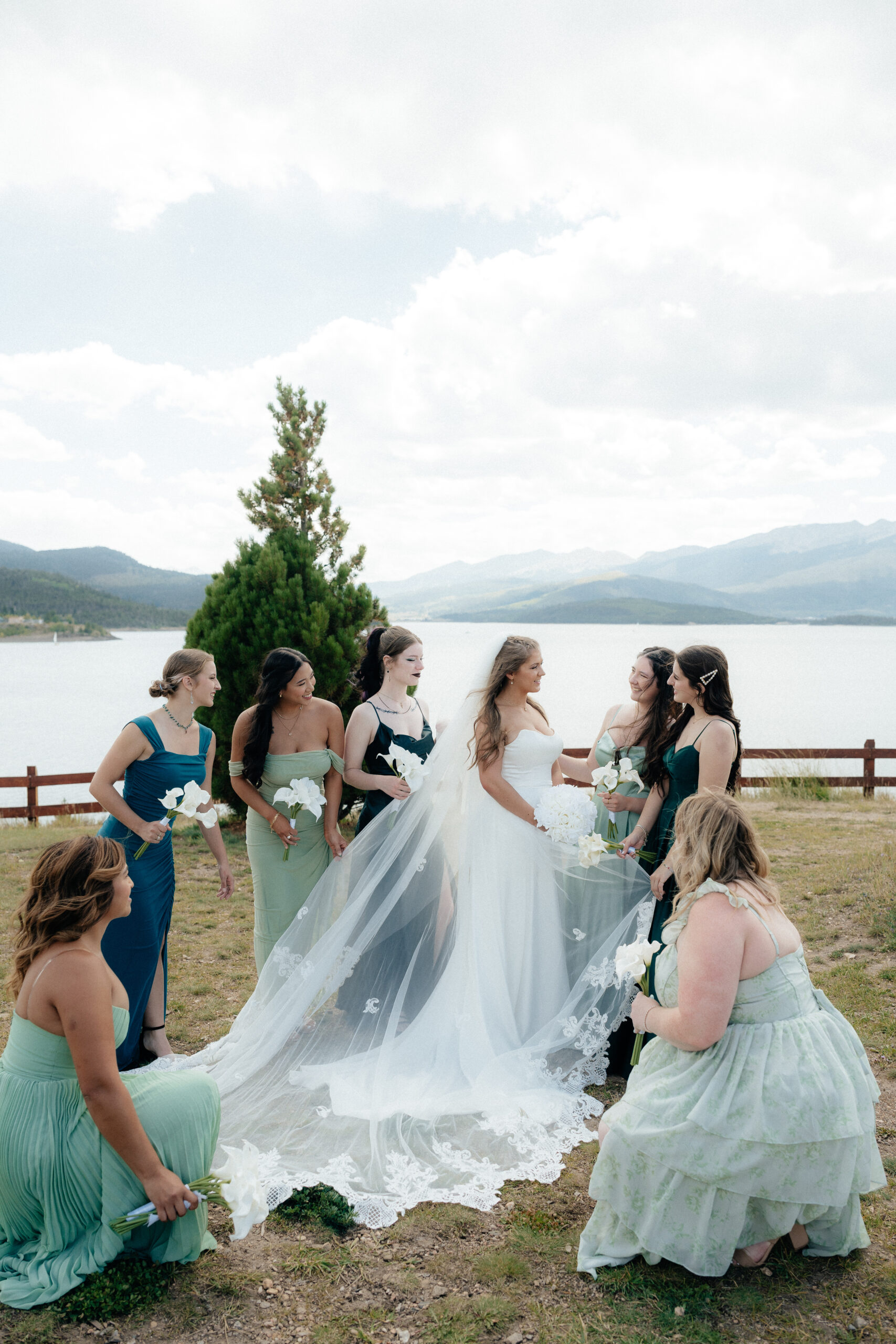
Shades of Blue with White
Blue is one of those colors that almost never fails. For spring weddings, mixing light blue or muted aqua tones with darker blues and white creates a really clean and classic look. Light blues feel fresh and airy, while deeper blues add contrast and keep things from feeling washed out. White ties it all together and keeps everything looking timeless!
This palette works especially well outdoors. Blue looks amazing against greenery, open skies, and neutral venues. It is one of those combinations that still looks just as beautiful in photos years later.
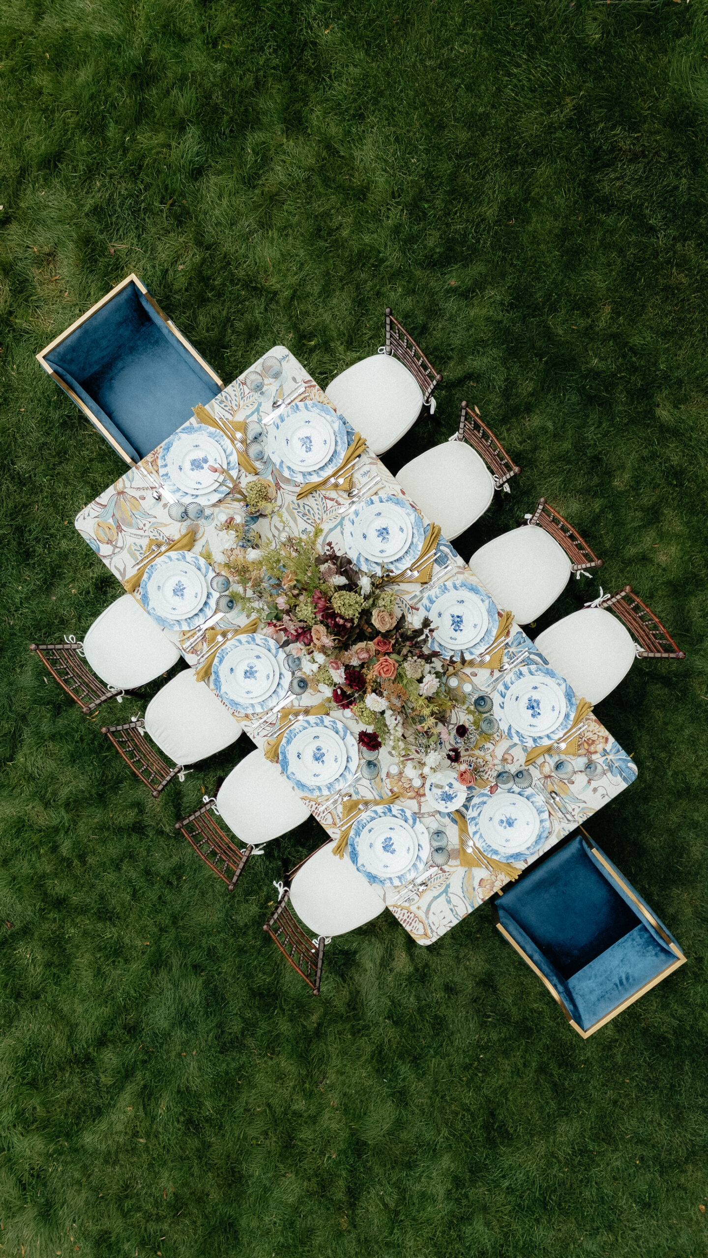
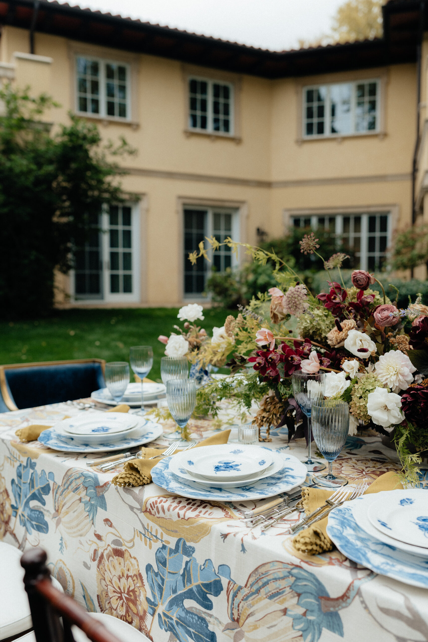
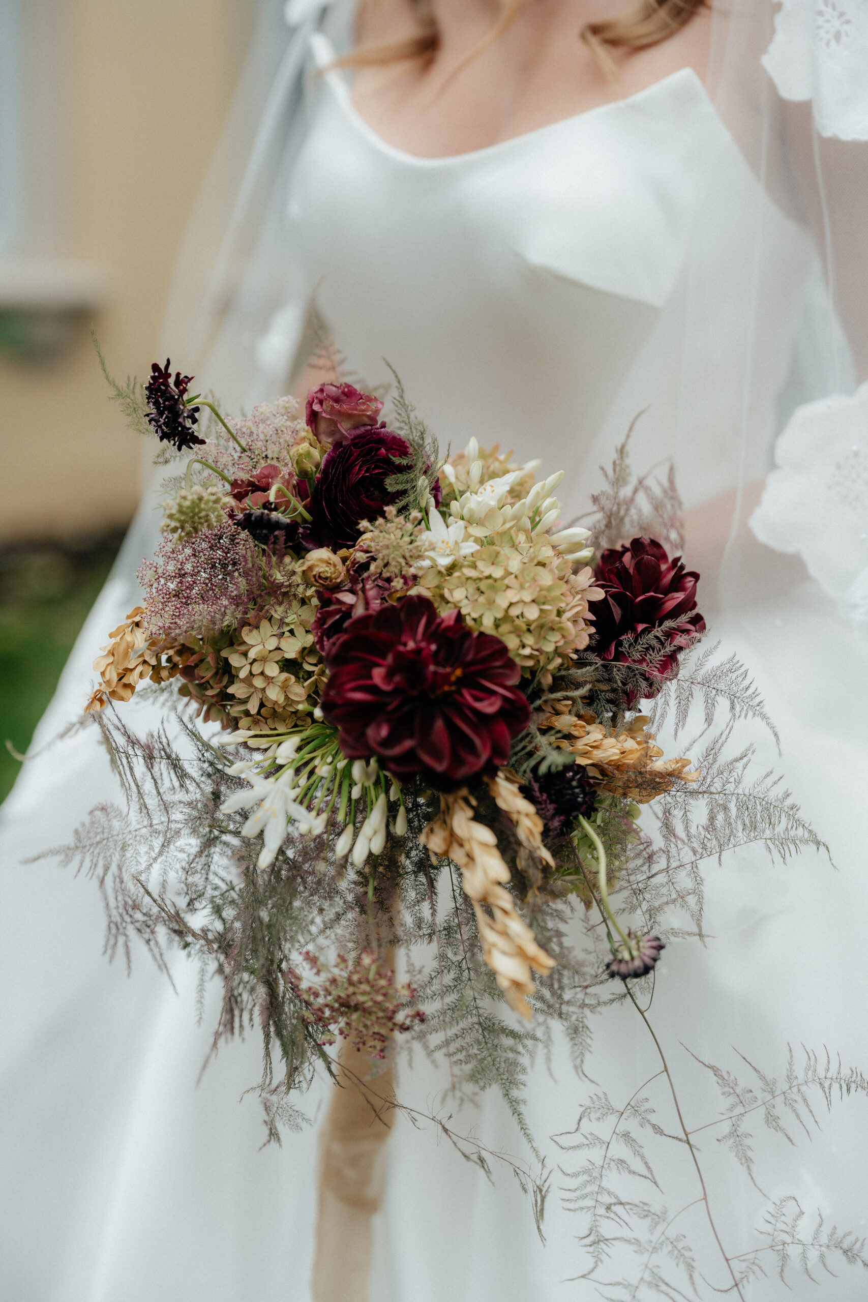
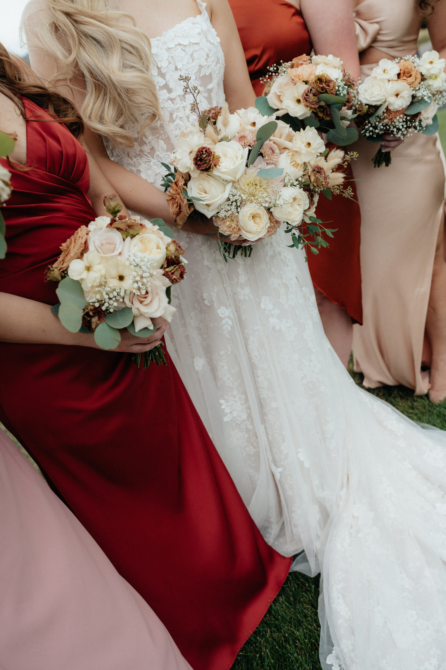
Burgundy, Creams, Light Pink, and Greenery
If you are drawn to richer colors but still want a soft spring look, this palette is such a good balance. Burgundy adds depth, while creams and light pinks keep everything romantic and not too heavy. Adding greenery instantly makes it feel fresh and seasonal.
Burgundy photographs beautifully in details like bouquets, suits, and dresses, while the lighter colors help balance everything out in portraits. It feels cozy and romantic without leaning too far into fall!
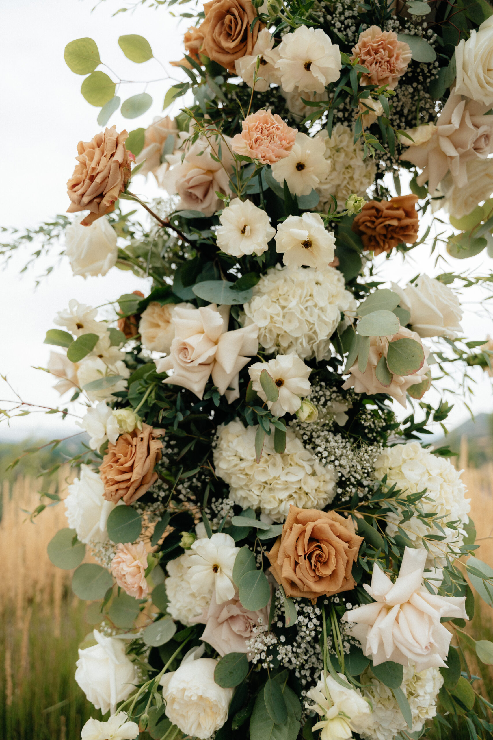
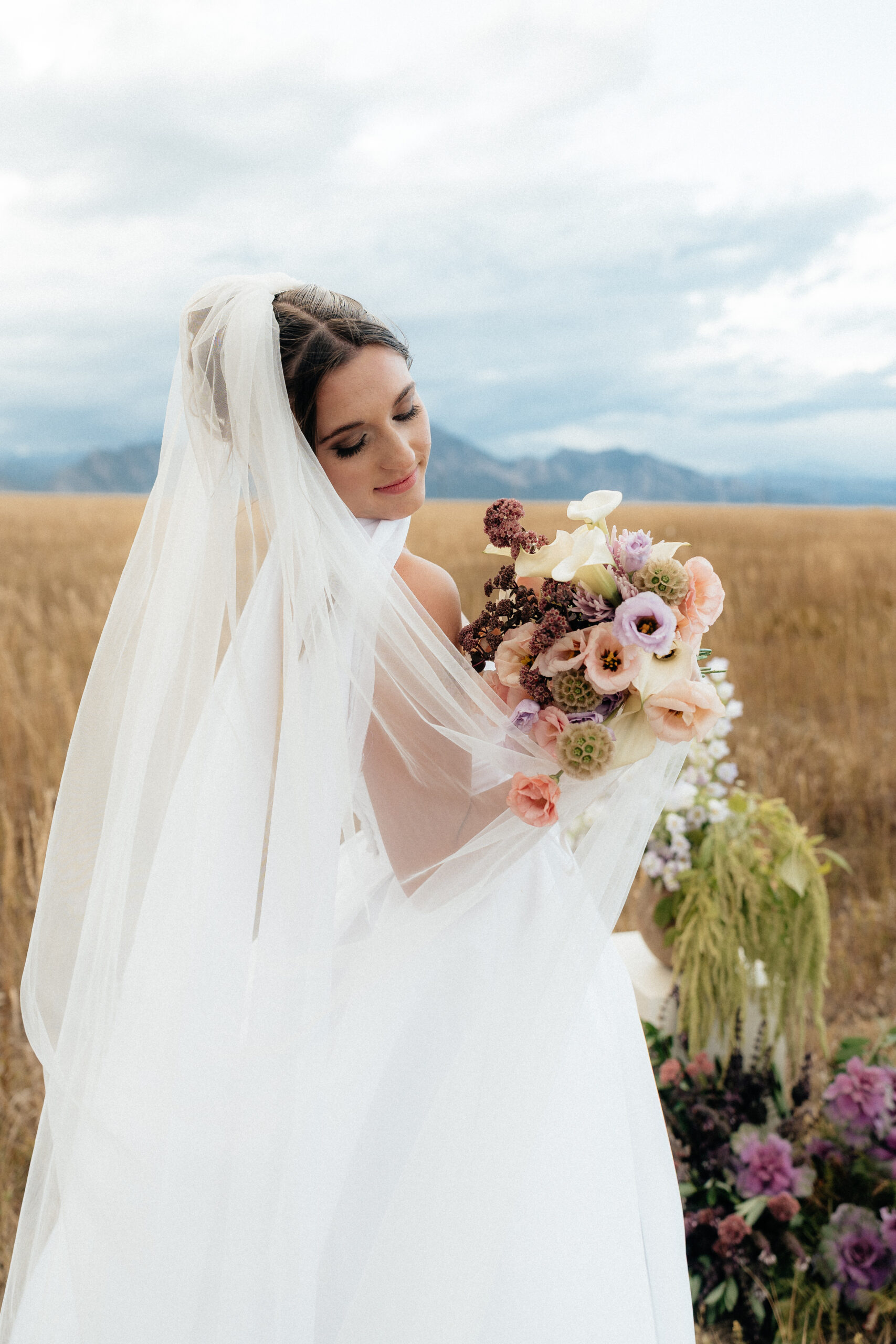
White, Light Pink, Soft Orang,e and Babys Breath
This palette is pure spring. White, light pink, soft peach or light orange tones, and babys breath create a soft romantic look that photographs incredibly well. Lighter colors reflect natural light, which helps photos feel bright and airy without being harsh. Babys breath is also one of my favorite spring florals because it adds texture and movement without ever stealing attention from the couple. If you love a timeless, effortless, garden inspired feel, this color palette is a beautiful choice!
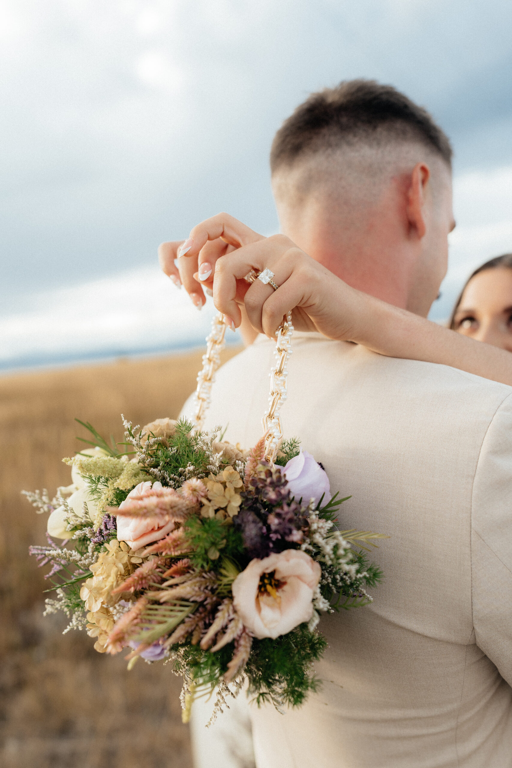
Shades of Purple with Light Pink and Greenery
Purple can be tricky, but when it is done in softer shades, it is stunning. Lavender, dusty purple, or muted plum paired with light pink and greenery feels romantic and a little whimsical without being overwhelming.
The key is keeping everything balanced. Softer purples mixed with pinks and natural greens photograph much better than bold or overly saturated shades. When done right, this palette feels unique while still staying timeless.
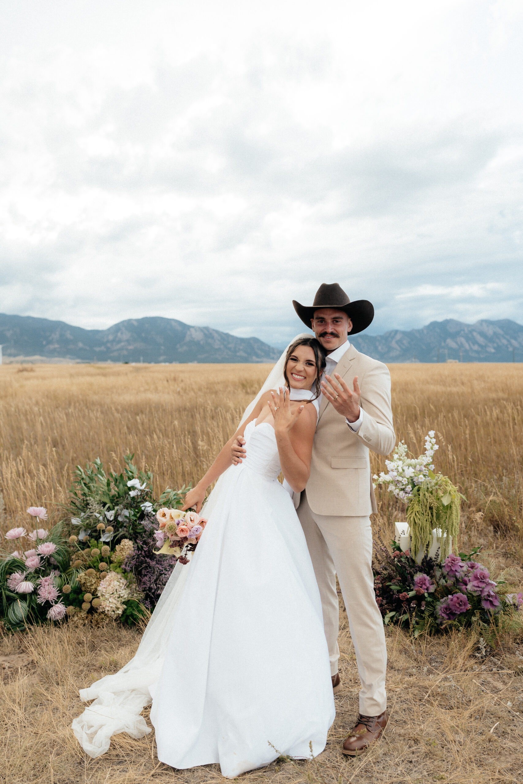
At the end of the day, your wedding colors should feel like you. Trends come and go, but photos that feel natural and cohesive will always stand the test of time!
Spring already gives you beautiful light and fresh scenery. Choosing a color palette that works with the season will help your photos feel effortless and romantic from start to finish. If you ever need help choosing colors that photograph beautifully and fit your vision, I am always happy to help.🤍 Click here for more!


